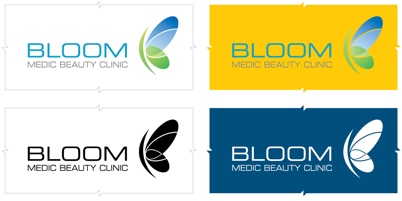
Bloom Medic Beauty Clinic providing the most advanced medical equipment in beauty industry. Providing quality, adhere honesty services and after-sales services in slimming and anti-aging treatments are their aims. Bloom Medic Beauty Clinic hope to lead the company philosophy for ladies in different ages giving proper skin care concept and exchange ideas.
Bloom Medic Beauty Clinic logo with simple, elegant, visual impact and harmony colour, represent the beauty, professional, reliable and medical concepts. Design to combine the brand positioning and corporate culture.
The beautiful metamorphosis is our concept, the butterfly letter B design represent company make a beautiful change, like a metamorphosis process of butterfly, like a dancing girl full of happiness.
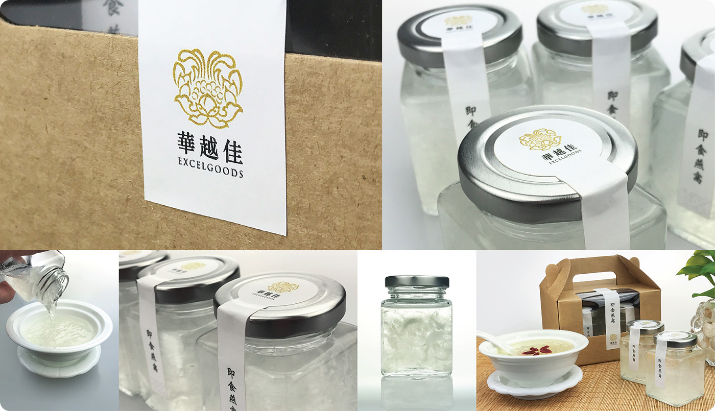
Excelgoods bird's nest integrated with capital markets and the bird's nest resources, to cooperate with standardise manufacturer. Hair removal with micro handmade technology, reverse osmosis pure water and reliable packaging process to ensure the products quality stabilize. As an industry rising star, they get the consumers favour very quickly. A kindly prices and excellent quality make the high nutrition bird's nest product excepted by everyone.
The product target to high-end customers in Mainland China, their brand image need to match the customer habits and mentality. The core idea of the brand combined with luxury health and beautiful.
Excelgoods mainly in food business, the brand icon designed in elegant Chinese fortunate clouds pattern, it is combined with different fresh foods in high class style. As a reliable enterprise, they are fully represent the professional position and branding.
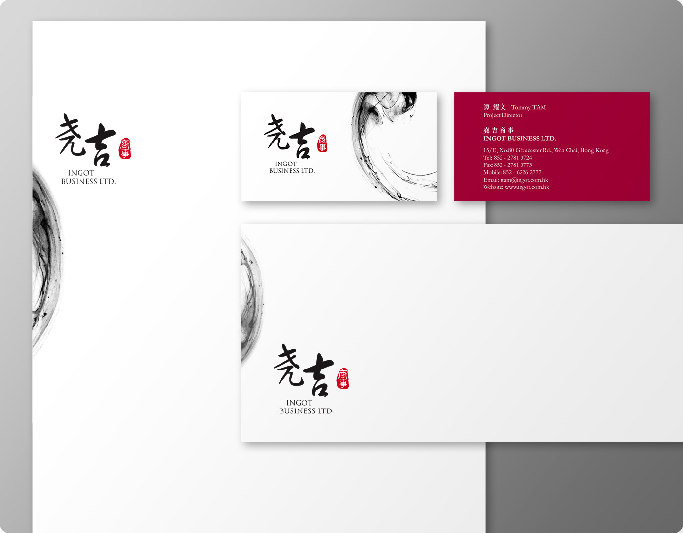
Ingot Business Limited was established in 2013, since then we have been expanding and diversifying our business into different sectors including development in skincare and cosmetics, interior design, investment immigration, air purification technology, catering and other overseas development projects, etc. Our business extends across regions covering Hong Kong, Mainland China, Korea and the Philippines.
The CI system designed in Chinese style, we choose a vitality ink brushes as main visual and deep red as primary color. A Western graphic design technique, strongly color contrast and spacing to represent Ingot Business Limited high-end Corporate Identity.
To create a new logo for MD FONSCARE. It should be seen as professional, discrepancies and innovative. We have consult to other logo design of food products in France, we found their concept all in simple and clear generally. The basic elements are included in symbol graphic and logotype with general static color tone.
Try the other way to represent a new brand logo design of food products. Use a simple graphic and font design, the elements themselves healthy, happiness, green and fresh meaning, modern style to show the company business and their nature more directly.
MD FONSCARE is a food product manufacturer, we create an innovative logo combined with three major ideas, all products are healthy, green and fresh. Green color to present healthy and environment foods, the lively typeface represent naturally and fresh splashing juice full of energy.
Established in 2012, SUMI Production Limited is an award-winning event design, production and management company in Hong Kong, Shenzhen and Guangzhou.
Wherever their business held across the Asian region, SUMI has a reputation for creating and delivering exceptional world-class events for local and international clients. The SUMI team is represented by a group of dedicated professionals who boast a diverse range of event design and integrated publicity services.
The logo concept contains different elements, including a satellite, compass, and microphone, representing broadcasting, navigator, communication and announcement.
Cadenza offers design, construction and project management services for the architecture and interior of commercial facilities. Their goal is to help clients to set up the most creative and effective facility both supports their business objectives and reflects their corporate image.
Together with the clients and professional team of architect, interior designer, engineer, project manager and builder, they strive to create tailor made solution that is not only aesthetical but also highly functional. Meanwhile, they are committed to deliver a high quality and sustainable project on schedule and at a competitive price.
The logo concept represents the construction, space, design and wealth management.
Wuhan Konifiber Biotechnology Co Ltd using konjac glucomannan series patent technology to research and development, produce and selling series of functional materials and products. They are in accordance with the objective of scientific, natural, healthy and concern, concentrated to develop a soluble fiber products for consumer health, fulfil their needs in balanced diet, health and relaxed life.
We are redesign a new brand icon in modern style to represent science and technology, that mean Konifiber's products with new technology as foundation and aspire to healthy concept, produce high quality healthy products.
The new brand logo contains different elements inside, a streamline design represent an attitude of the modern consumer healthy and fashionable lifestyle, the symbol combined with a konjac shape and Chinese traditional culture, the computer graphic is a molecular structure of konjac glucomannan.
The combination of simple typography design and golden color can make the brand image more standing out and high.
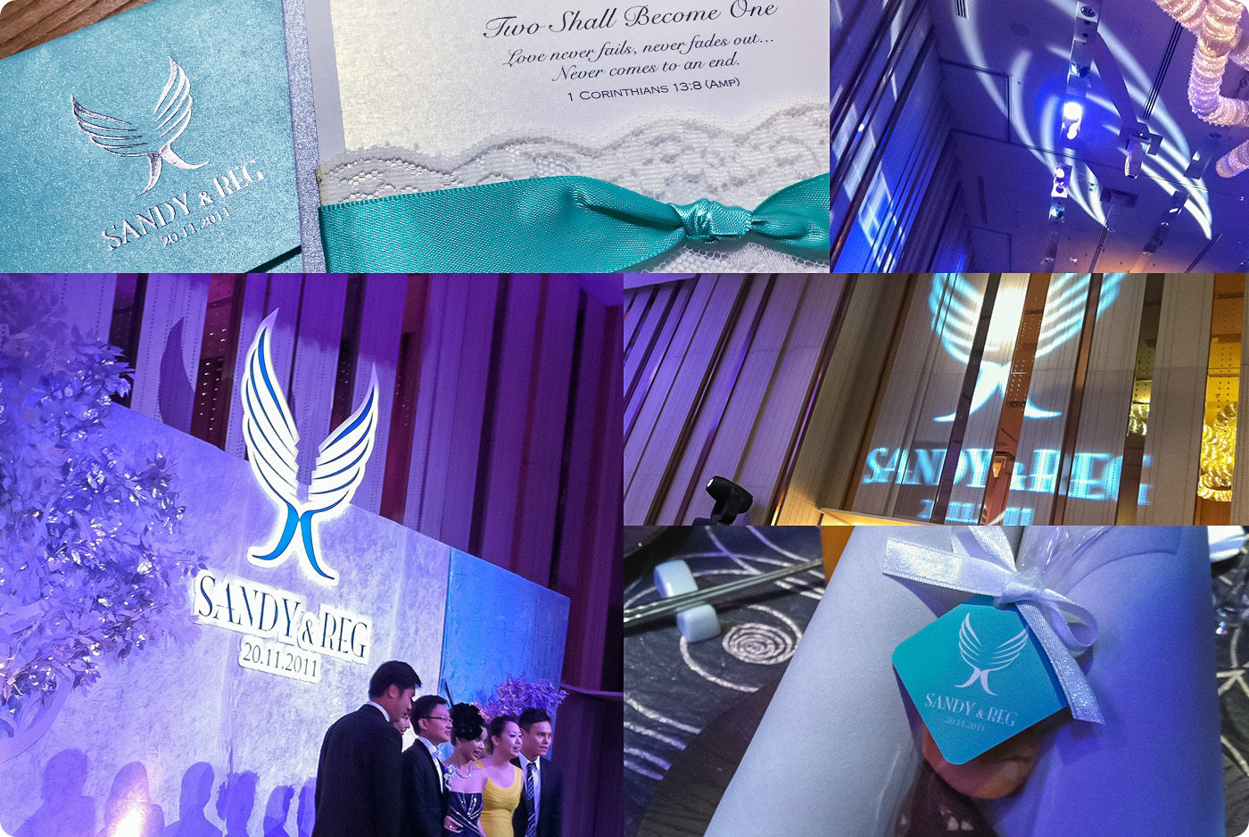
We creates a personalized wedding monogram logo for a happy couples, they use their own logo on an invitation card, backdrop, programs, souvenir and other decorations. The concept to present an elegant and grand wedding ceremony, the wedding monogram logo combined with different meaning including letter S and R, a pair of lovebirds flying together, celebration and a romantic stuff.
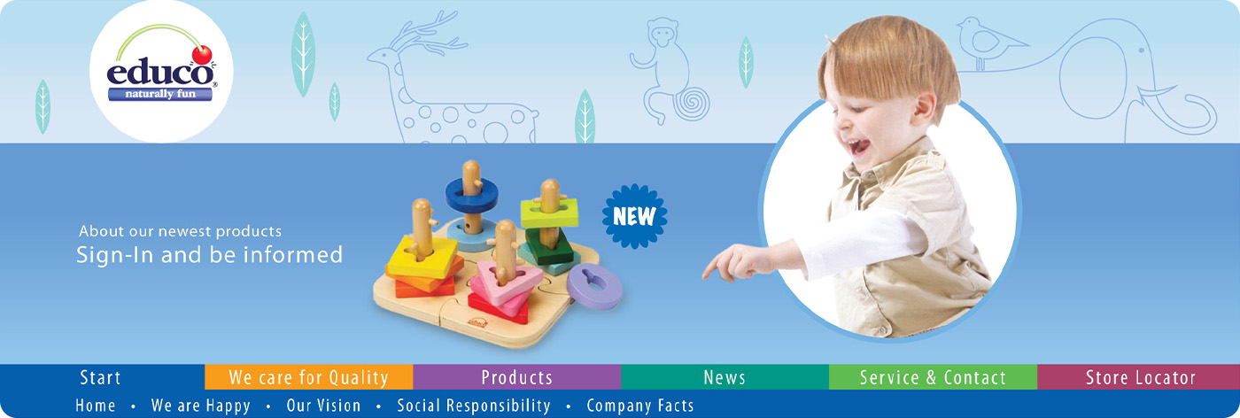
EDUCO needed a clearly defined brand image and a new identity that would better express its mission. In addition, our challenge was to modify its visual identity without radically changing it. Having consistency between all expressions of the brand was a key challenge.
The new dynamic visual identity are vibrant, spirited and motivating, that's energetic, playful, and inviting people to have naturally fun of a unique experience.
Yacca created a holistic identity system in naturally and green inspirations, including marketing collateral, product packaging, POP, website and advertising formats. The design was extended to the retail environment for a complete branded experience.
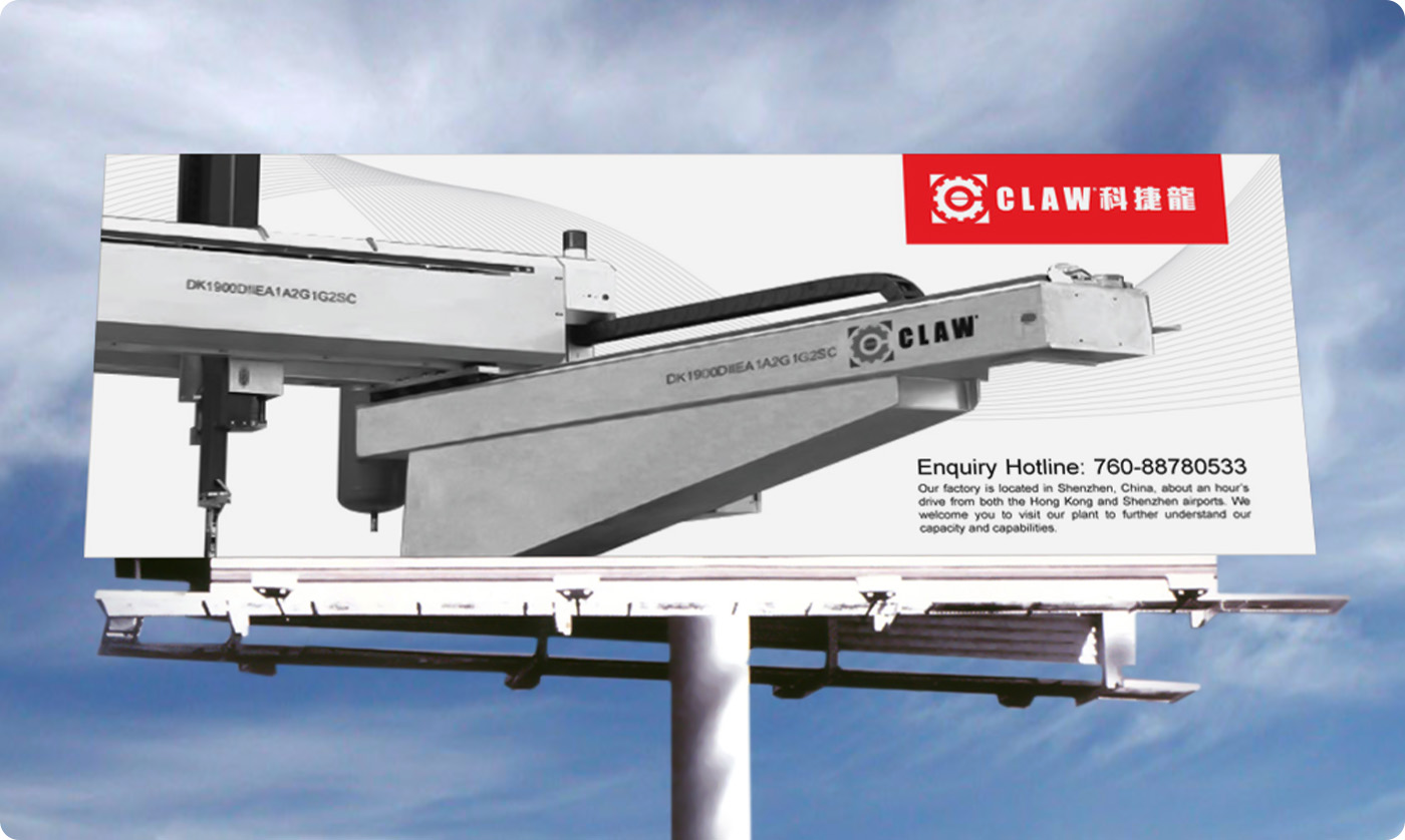
The company has become a largest robot manufacturer today. Independent product manipulator arm has reached the international advanced level. They are successfully into the European market and become the preferred high-end customers brand manipulator. The production could save energy and time, excellent quality, stable performance and got well evaluation by customers.
CLAW to cater for the business development, need to be redesigned the brand identity, planning and establish brand image. The company products with advanced technology, each parts are precise, exterior design is unique, so the logo design all around the related concept, it is from exterior that thoughts can reflect their character of the CLAW product.
The brand logo concept mainly by two parts combination, these include the CLAW product structure elements, gear modeling brings out the brand and product relationship, the gear represent CLAW identity, the center is a tiny unscrew, outside is four arrows, mean the company philosophy starting from their heart and all details, bring CLAW professional products to the worldwide customers.
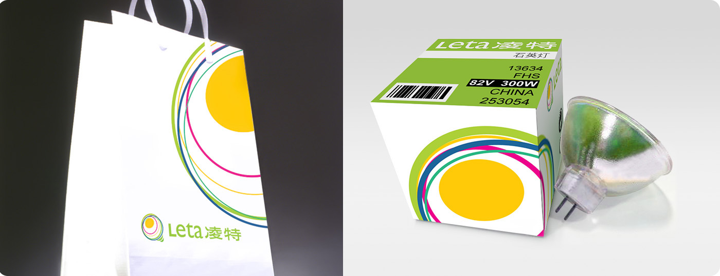
Create and build a new brand in high-end grade mainly. Leta product line covers electrician and lighting two categories.
Their business philosophy is "light is just a family warm", the real home live styles is lighting, and bring a warm feeling to consumers with lighting.
The logo design is a part of branding, lively graphic represents everything about living, clearly appearance and color represents the brand attributes, stylish design standing out from the other similar brand.
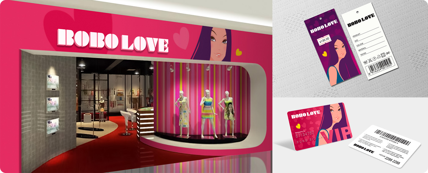
Bobolove is fashion, good quality with different styles casual wear brand for trendy young people and white collar.
In terms of a cartoon girl as brand’s spokesperson, a fashionable design easier to please. From dressing and facial expressions, the beautiful girl icon has an attractive appearance, lead most young people to follow and consumption. Logotype has reliable and honestly feeling, represent Bobolove’s products make confidence guarantee and build up an imported brand image.
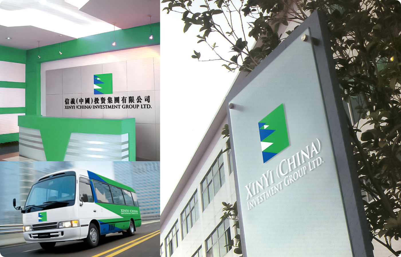
Xinyi Investment Group is a large investment group was founded in Hong Kong since 2002. The group core business predecessor is Xinyi Technology Investment Company. Xinyi Investment Group major in an investment services. In extension, they provide venture capital related value added services that promote the development of high-tech industries in China.
After the group restructuring, they need a brand new logo and unified the old VI system. New logo design concept is a traditional sail to represents an enterprise in Hong Kong, symbolizing no fear of storm and mean go forwarding.
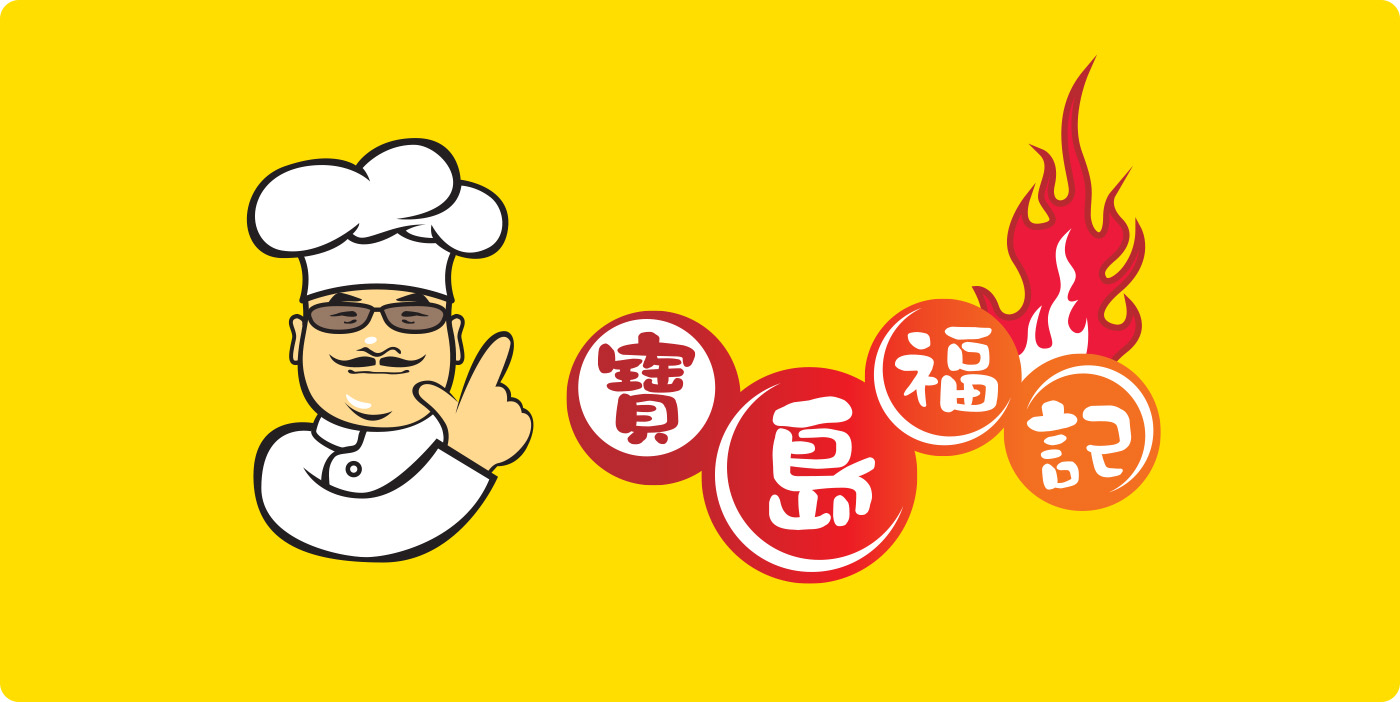
The shop cover an area of more than 800 square feet, mainly provides Taiwan style hotpot, especially for various spicy foods. Front door image printed on red and yellow color to bring out the theme, cartoons style founder face, clearly graphic image most impressive and unforgettable.
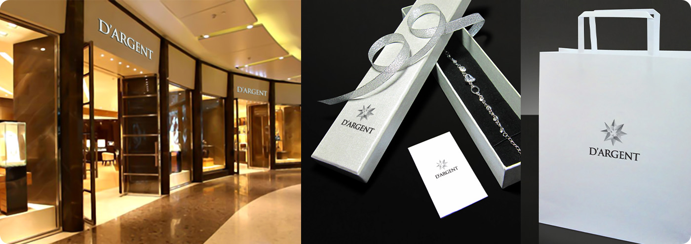
A new brand in order to cater the consumption market in Mainland China, D'ARGENT entrust Yacca design of a complete set of brand identity system, including logo and typeface design, image and product packaging, retail shop decoration etc. Build an elegant and high class European brand for D'ARGENT.
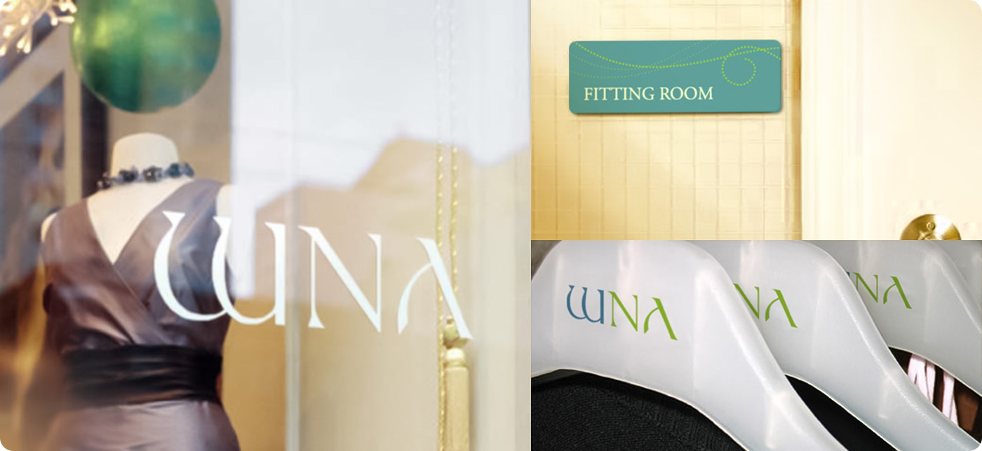
WNA is a small boutique sell high grade ladies fashion, most popular for quality evening dressing. The target customer around 18 and 30 young peoples and the shop has fitting room. From logotype to front door design with simple style, with comfortable environment and friendly service, so make WNA have their own customers.
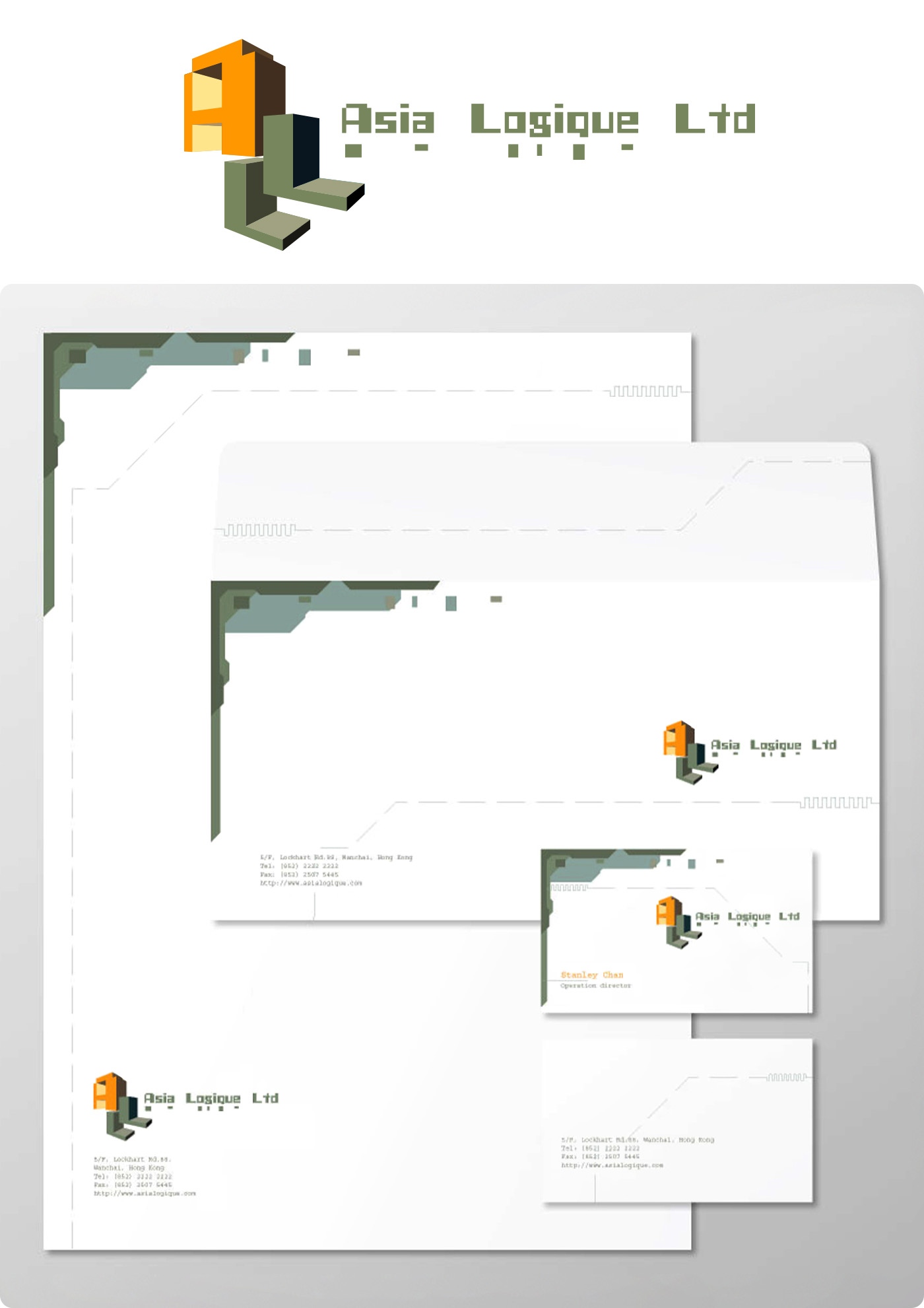
Asian Logique Ltd specially develop and provides applicable for image measurement, detection, positioning, tracking multiple visual identification of hardware and image processing system, the system cover an industrial production, intelligent transportation, aerospace and other image processing applications.
Logo design there are high-tech and transporting thoughts included, brightly color and 3d shape make a corporate image full of energy.
Wing on transportation company core business in school bus transportation, the customers are kindergarten and primary school students, to establish a clearly reliable image and make students and parents confidence.
After our team's analysis, we are creating a nature theme with children's character. Sunshine graphic, protection meaning, step forward and company name elements to bring clients deeply impression. Make their business grow up in short period of time.
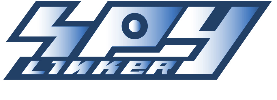
SPYLINKER specialized for electronic components and equipments, products included IR water-proof camera, color dome camera, day/night wide dynamic camera, super high resolution and hi-sensitive high-end cameras, DVR, monitor etc.
Priority customers are foreign buyers. To match foreigner’s habits and marketing, the logo design should have dynamic feeling, interact with hard shape and cool electronic products, and easily make customers have a branding effect.
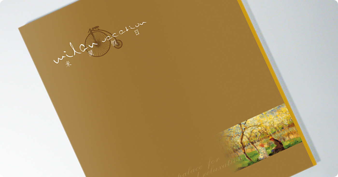
Milan Vacation is a residential property project in Mainland China, adhering to the trendy and their business philosophy, house design in the European style and trendy style. This Project is located in the middle of city, elegant and quite collocation to build a recreational style.
The logo design with 20s-30s European garden style as the theme, relaxed nature gimmick represent the brand positioning, and they have a good reaction during the released period.
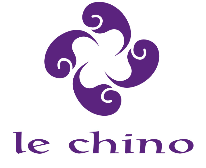
Le Chino is a gift company, products including office stationery and fine jewelry. Brand positioning in high-grade style, the products mainly export to oversea market.
The logo design combines eastern and western elements, the elegant graphic full of Chinese artistic style, and western simple processing technique, let their customers to understand the Lechino culture and market philosophy.
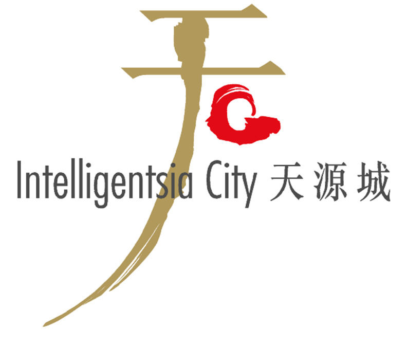
The Intelligentsia City is another residential property project in Mainland China, although they are located in new territories area but peripheral mature and traffic is convenient. The Intelligentsia City designed by a foreign famous architecture, the whole project with the traditional Chinese and the western architectural style, divided to a different thematic district. The integral environment as like as place in fairyland.
The logo design full of strongly Chinese style, whatever from color and graphic design, the logo is simple, high-class and generous, showing the brand identity and positioning of Intelligentsia City.
Daily Ride is a transportation company, core business for travel transportation, the customers are kindergarten and primary school students too.
YACCA use the first Chinese letter of company name "YIN", and make it look like a truck, and put the short form of "Daily Ride" into the "truck". Brightly red color more outstanding the business nature.
© 2025 Yacca & Design Company. All rights reserved.